Snir Amar Design
Atomic Design System
I led the creation of a scalable atomic design system to standardize UI patterns, improve cross team consistency, and accelerate product development across products.
Role:
Lead Senior UI/UX product Designer.
Timeline:
Initial system foundation built in 1 month, with ongoing expansion and governance.
Scope
Cross product design system
Component architecture
Design tokens
Documentation and guidelines
Governance and adoption model
Impact:
-
Reduced UI inconsistencies across products and teams
-
Improved design-to-development collaboration and handoff efficiency
-
Increased component reuse and system scalability
-
Established a single source of truth for product design decisions

Why This Matters
As products scaled, inconsistencies in UI patterns, spacing, and component behavior began creating friction across design and engineering teams. Components were recreated, design decisions varied between features, and development slowed as the system became harder to maintain.
To support long term scalability, I led the creation of a unified design system that standardizes design decisions, improves collaboration between design and engineering, and enables faster, more consistent product development.
System Overview
I designed a responsive Atomic Design System to bring consistency, scalability, and clarity across products. The system reduces duplication, supports responsive behavior across screen sizes, and establishes a single source of truth for design and development.
By structuring components into reusable building blocks, the system improves efficiency, reduces maintenance overhead, and creates a scalable foundation for future product growth.
What is Atomic Design and Why I Chose It?
Atomic Design, introduced by Brad Frost, is a methodology for building design systems by breaking interfaces down into smaller, reusable components that scale into larger structures. This creates a clear hierarchy and improves consistency across products.
The Atomic Design structure includes:
• Atoms - foundational elements like colors, typography, and buttons
• Molecules - combinations of atoms such as form fields or input groups
• Organisms - larger components like tables, navigation, or dashboards
Traditional design systems often evolve as collections of components without a clear hierarchy. As products scale, this can lead to duplication, inconsistencies, and difficulty maintaining components across teams.
I chose Atomic Design because it provides a scalable framework that supports system growth, improves component reuse, and aligns design and engineering around a shared structure. This approach made the system easier to maintain, more predictable, and naturally scalable across devices and products.


Process & Methodology
1. Audit & Research
-
Collected all existing UI elements across projects
-
Identified duplicates and inconsistencies
-
Defined guiding principles: accessible, scalable, consistent, reusable
2. Atomic Design Breakdown
I structured the system following Brad Frost’s Atomic Design framework:
-
Atoms: Colors, typography, spacing, icons, buttons, badges
-
Molecules: Avatars, forms, tags, snackbars, progress bars
-
Organisms: Lists, trees, navigation, cards
-
Templates & Pages: Larger compositions demonstrating usage
3. System Building
-
Created tokens for colors, typography, spacing, and shadows
-
Built each component in Auto Layout with Variants & Boolean properties
-
Applied naming conventions to prevent misuse (dot-prefixed subcomponents, etc.)
4. Documentation
-
Each component documented with: overview, purpose, variants, anatomy, behavior, and usage
-
Added disclaimers (e.g., dot-prefixed parts are not to be used independently)
-
Created usage guidelines for designers and developers


System Architecture
To create a scalable foundation, I structured the design system using Atomic Design principles. This approach allowed components to scale from foundational tokens to complex UI structures while maintaining consistency across products.
The system architecture included:
• Design Tokens (colors, spacing, typography)
• Atoms (basic UI elements)
• Molecules (combined UI elements)
• Organisms (complex components)
• Responsive behaviors and variants
From Atom to Organism: Date Picker Component
To demonstrate how the Atomic Design system scales in practice, I used a Date Picker component to show how foundational elements evolve from atoms to a fully functional organism.
Atoms:
The smallest building blocks, including calendar day buttons, labels, and icons. Each atom supports multiple states (default, hover, focus, selected, disabled) and is driven by design tokens for color, spacing, and typography.

Molecules:
Atoms combine into functional units such as calendar grids or input fields. Molecules establish structure and consistency, ensuring predictable behavior and reusable component patterns.


Organisms
The Date Picker becomes a fully functional component assembled from molecules and atoms. It includes variants such as open and closed states, responsive behavior across screen sizes, and optional elements like hint copy.
At the organism level, the component can be reused across forms, modals, and scheduling flows without additional customization, ensuring consistency and scalability across products.


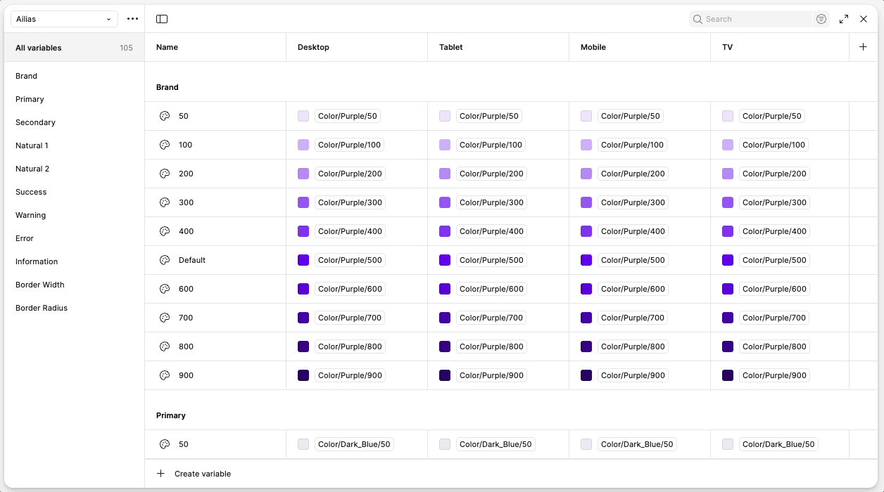
Atoms: Color Tokens
Colors form the most fundamental layer of the system. Each token represents a single color value, ensuring consistency across every screen and state. To make them purposeful, I built an alias collection—where each color is mapped to a role, like Brand, Primary, Error, or Success
.
This approach means:
-
Designers don’t just pick a shade; they apply a color with a defined purpose.
-
Developers can implement tokens directly without second-guessing usage.
-
Updates cascade across the system, keeping products unified and easy to maintain.
Atoms: Typography Tokens
-
Tokens define headings, labels, and paragraphs with fixed size, weight, and spacing.
-
Standardized across devices to avoid mismatched fonts.
-
Built for accessibility, ensuring readable hierarchy at any screen size.
Typography tokens create a predictable reading experience, improving clarity and reducing errors when scaling across platforms.


Atoms: Spacing & Size Tokens
-
Based on a 4px base unit, scaling up for margins, padding, and grids.
-
Prevents designers and developers from guessing spacing values.
-
Keeps layouts balanced and reusable across responsive breakpoints.
-
This structured spacing system brings rhythm and order to layouts, ensuring designs feel consistent and clean while remaining adaptable.
Atom: Components
Atoms are the foundation of the system—buttons, inputs, checkboxes, toggles, and other single-purpose components. Each is token-driven, responsive by design, and built with accessibility in mind.
What you see here is just an example of some of the atoms in the library. Every atom was designed with consistent states (default, hover, focus, disabled, error, success) and scalable sizes, ensuring they can be reused predictably across any screen size or product flow.
This consistency makes the system easier to maintain, speeds up design and development, and reduces design debt over time.

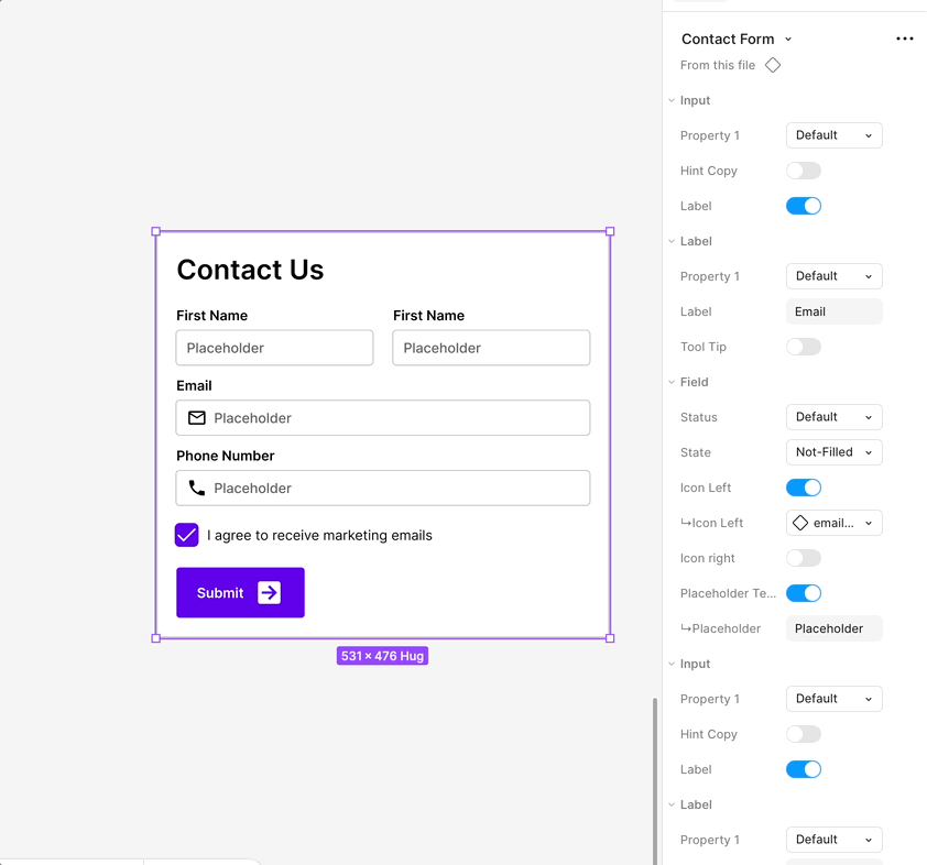
Molecules
Defined Fields are molecules built from input atoms—labels, icons, placeholder text, and borders—combined into a reusable component. They provide clarity, consistency, and accessibility for form entry.
-
Atoms used: input field, label, icon, placeholder, border, color tokens
-
Variants: Default, Hover, Focus, Error, Success, Disabled
-
Purpose: guide user input with clear states and feedback
-
Benefit: scalable for forms like login, search, or checkout

Organism: Tables
Tables are organisms built from atomic elements (text, icons, checkboxes, status) and molecular structures (rows, columns, pagination). They organize and display complex datasets in a consistent, scalable format.
-
Atoms used: text, icons, checkboxes, status labels, color tokens
-
Molecules used: rows, columns, pagination controls
-
Variants: sortable, filterable, resizable columns, different row states
-
Purpose: present and manage structured data efficiently
-
Benefit: scalable for admin dashboards, reports, and data-heavy interfaces across screen sizes

Documentation
The documentation serves as the backbone of the design system. Beyond showcasing components, it explains their purpose, usage, and behavior so they can be applied consistently across projects.
-
Use cases: when and where a component should be applied
-
Variants & states: how components adapt to interactions (default, hover, focus, error, success, disabled)
-
Spacing & sizing: guidelines for alignment, padding, and responsiveness
-
Statuses & anatomy: breakdown of parts (labels, icons, fields) and how they behave together
-
Behaviors & interactions: how components respond to user input and context
Purpose: provide clarity and ensure alignment between design and development
Benefit: reduces ambiguity, speeds up handoffs, and ensures components scale predictably across products

Governance & Adoption
A design system only works if it’s adopted and maintained. To ensure longevity, I structured the system as a living library with clear rules for updates and usage. This makes it easy to scale while preventing fragmentation over time.
-
Versioning: updates follow a controlled process to avoid breaking existing work
-
Feedback loops: components evolve based on real product needs
-
Structure: subcomponents prefixed with a dot to prevent accidental misuse
-
Consistency: token-driven setup ensures any change cascades system-wide
By treating the system as a product in itself, it remains flexible, scalable, and ready to grow with future projects.